CHART EXAMPLES OF FLAG AND PENNANT PATTERNS / COMMODITIES
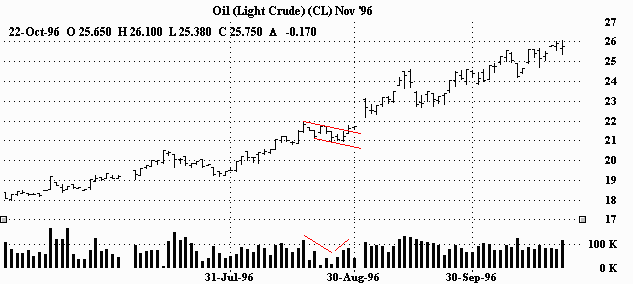
"BULL" FLAG IN AN UPTREND (BULLISH)
After a sharp rally, this "bull" flag served as a breather before running off again in the same direction. You can see the volume ease up a bit in the beginning of the flag, but then pick up as it nears the top of the formation and blows through it.
"BULL" FLAG IN AN UPTREND (BULLISH)
"Bull" flag in an uptrend. Quick rally, short pause, blast higher. Volume dips in the flag and surges on the breakout.
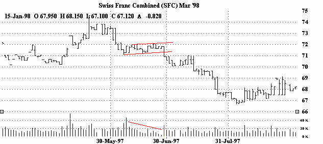
"BEAR" FLAG IN A DOWNTREND (BEARISH)
"Bear" flag in a downtrend. After a big rout, the flag seemingly presents a chance to re-group before continuing in the same direction (down.) Volume diminishes during the pause and then rapidly expands on the continuation.
"BEAR" FLAG IN THE BEGINNING OF A DOWNTREND (BEARISH)
After a big dump, this "bear" flag sets the stage for another quick and even larger fall. Volume decreases considerably in the flag, but the break to the downside is accompanied by a big increase in activity.
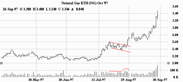
"BULL" PENNANT IN AN UPTREND (BULLISH)
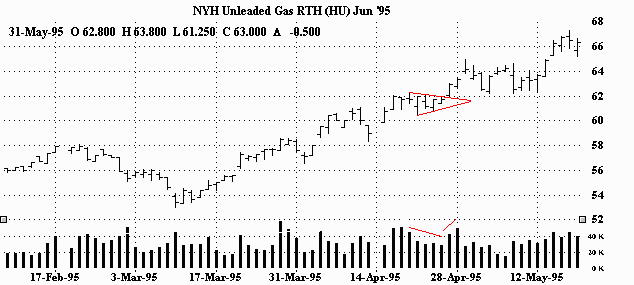
"Bull" pennant in an uptrend. After a month long rally, the market takes a five day breather and continues even higher. Volume dips briefly and then picks up on the breakout.
"BULL" PENNANT IN AN UPTREND (BULLISH)
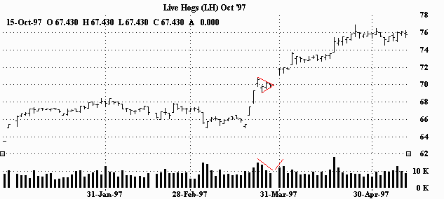
How's that for a pattern? Remember from the preceding page; 'pennants look very much like symmetrical triangles, but are typically smaller in size (volatility) and duration.' After a near straight up advance, the market takes only three days before resuming the upmove. During those few days, participation drops off a bit, but comes back as the market explodes out of the pennant. (Take a look at all those gaps right before and right after the pennant. Obviously a very strong and convinced market!)
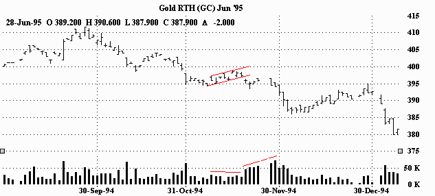
"BEAR" PENNANT IN A DOWNTREND (BEARISH)
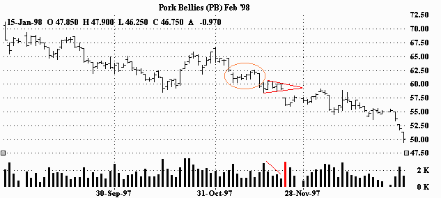
"Bear" pennant in a downtrend. This pattern came right after a 'bear' flag breakout. (Can you see it?) This pennant also presents only a brief pause before the market reasserts itself in the direction of the trend (down.) Volume dips in the pattern and jumps as the market breaks out and gaps lower.
"BEAR" PENNANT IN THE BEGINNING OF A DOWNTREND (BEARISH)
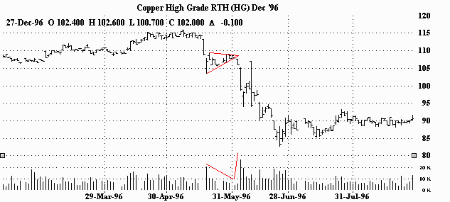
"Bear" pennant in the beginning of a downtrend. After a dramatic two day plunge, the market has a short lived consolidation. The rout continues and the market collapses. You can see activity dry up in the pennant. The breakout though, was made on extremely heavy volume.
===> Click
 Subscribe to Bursa Chat by Email
BACK TO CHAT BOX